VIEW

M.

Coursera Dashboard | Usability Test

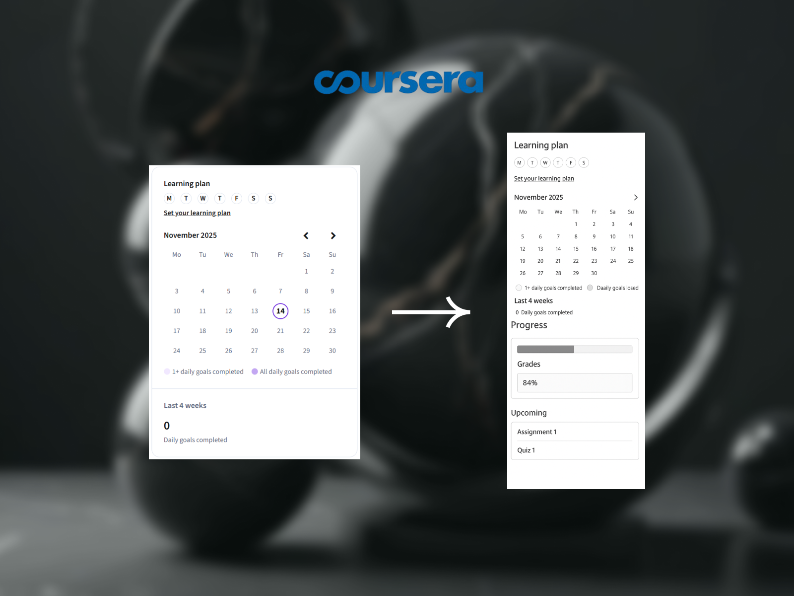
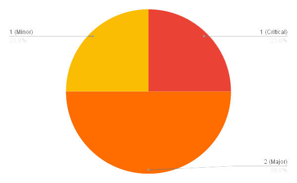
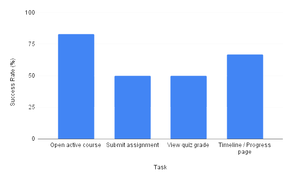
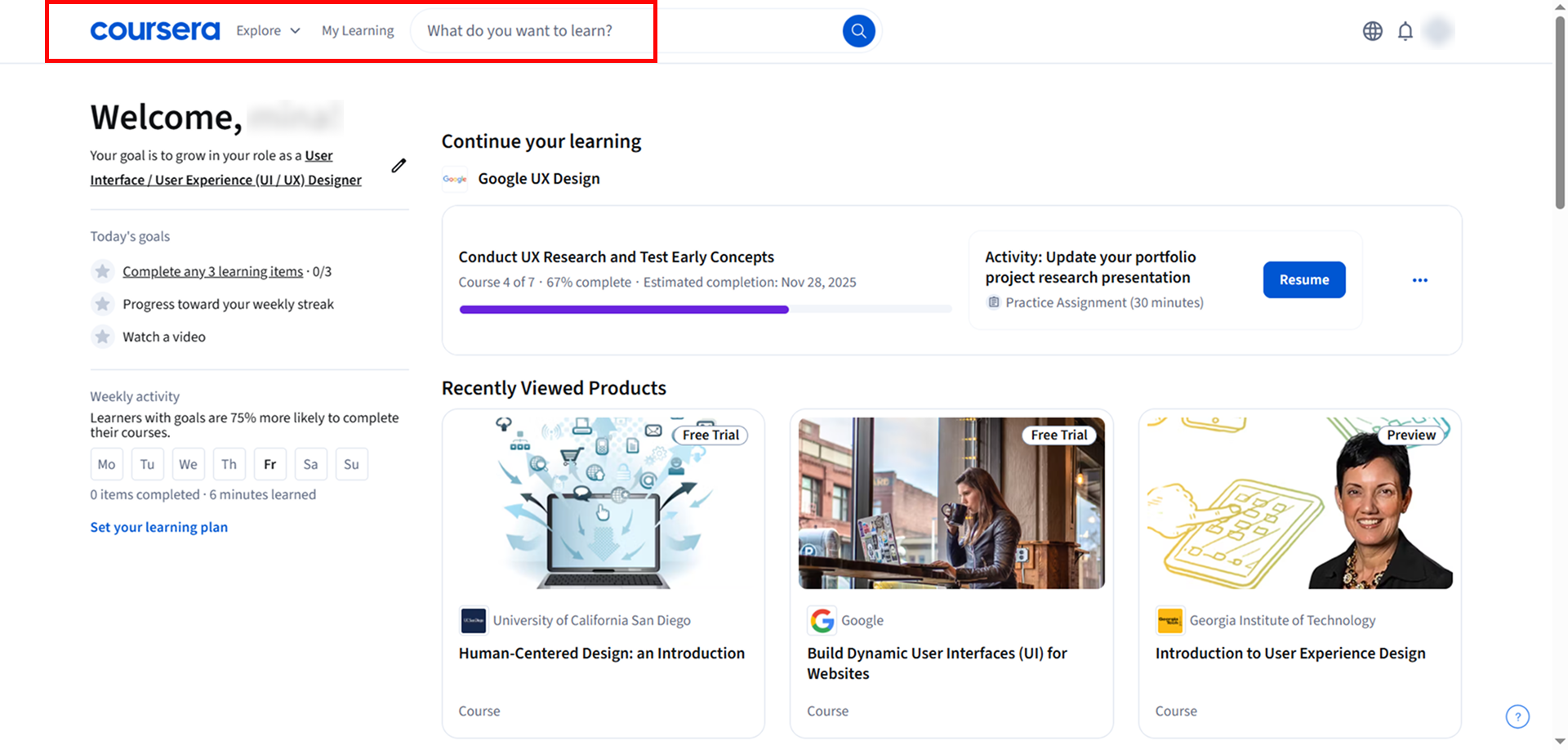
Coursera is one of the world’s most widely used online learning platforms, yet many learners struggle with navigation, assignment submission, and finding key academic information.
This study evaluates the usability of Coursera’s core learner workflows through moderated user testing, quantitative task metrics, and qualitative observation.

Goal

Identify friction points in essential course-related tasks and recommend actionable improvements that enhance task efficiency, clarity, and user confidence.

Research Questions

  1. Can learners easily navigate to their active course?
  2. How efficiently can users locate and submit assignments?
  3. Do users understand where to find their quiz grades?
  4. Is the Progress/Timeline page intuitive and informative?
  •  

Participants

6 university students (P1–P6) who actively use e-learning platforms but have varying familiarity with Coursera.

Objectives

  • Moderated remote usability sessions

  • 4 core tasks

  • Think-aloud method

  • Screen recording + time measurement

Tasks Tested

1

Open active course

2

Find & submit assignment

3

View quiz grade

4

Navigate to Timeline/Progress page

Key Findings (High-Level)

  • Navigation inconsistency caused major confusion across tasks

  • Users frequently misinterpreted labels like “My Learning”, “Explore”, and “Progress”

  • Assignment submission flow was unclear and required multiple backtracks

  • Users were unsure where grades were located

  • Progress page terminology did not match user expectations

Top Usability Issues

1) Assignment submission is difficult to locate

Severity: 4 — Critical
User quote: “I couldn’t find where to submit my assignment.”
Impact: Task success dropped to 50%; users repeatedly misclicked.

2) Misleading or unclear navigation labels

Severity: 3 — Major
User quote: “Is it ‘My Learning’ or ‘Explore’? Not sure where to go.”
Impact: Users lacked confidence and did not understand the course hierarchy.

3) Grades misplaced from user expectations

Severity: 3 — Major
User quote: “I thought quiz grades would be in the timeline.”
Impact: Multiple users navigated to wrong sections repeatedly.

4) Timeline/Progress page lacks clarity

Severity: 2 — Minor
User quote: “I expected my grades in the Progress page, not in a separate section.”
Impact: Increased task time and unnecessary exploratory clicks.

Recommendations & Redesign Suggestions

1) Improve clarity of course navigation structure
  • Add a clearer Dashboard label
  • Highlight “My Learning” when user is inside the dashboard
  • Add a visual separation between browsing and personal learning
Artboard-34
2) Redesign dashboard’s sidebar
  • Group progress-related items together
  • Make “Grades” more visually prominent
  • Add icons or better labeling
  • Reorganize menu sections for clarity
  •  
Artboard-34
3) Consolidate grade information
  • Add progress indicators
  • Add upcoming deadlines
  • Add grades preview or link
  • Make the purpose clear (study streak vs. assignment timeline)
Artboard-34

The usability study provided clear evidence that Coursera’s learning experience can be significantly improved through:

  • More intuitive navigation

  • Clearer hierarchy of information

  • Transparent grading flow

  • Better labeling and icon consistency

This evaluation created a foundation for redesign proposals focused on reducing task time, improving user confidence, and supporting a smoother learning journey.

Final Outcome